Week 2 B
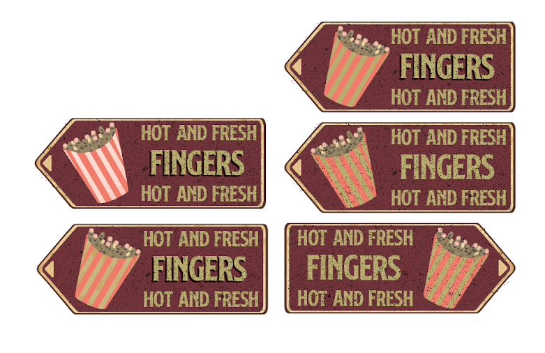
I decided to go with the french fry container on the retro style sign idea for my final product. I added a bunch of gritty textures to really give it the vintage and dirty feel to it. I made a few different versions altering the layout and coloring to see what would work better. In the end I decided to stick with the muted color style instead of adding the white to the container. I was playing around with drop shadows on the word finger especially. After I did some research I found out that on most of the vintage signs, the main product that was being advertised typically had a drop shadow while the other text did not. Below is the final product and below that is the different iterations of the styles.


Comments
Post a Comment